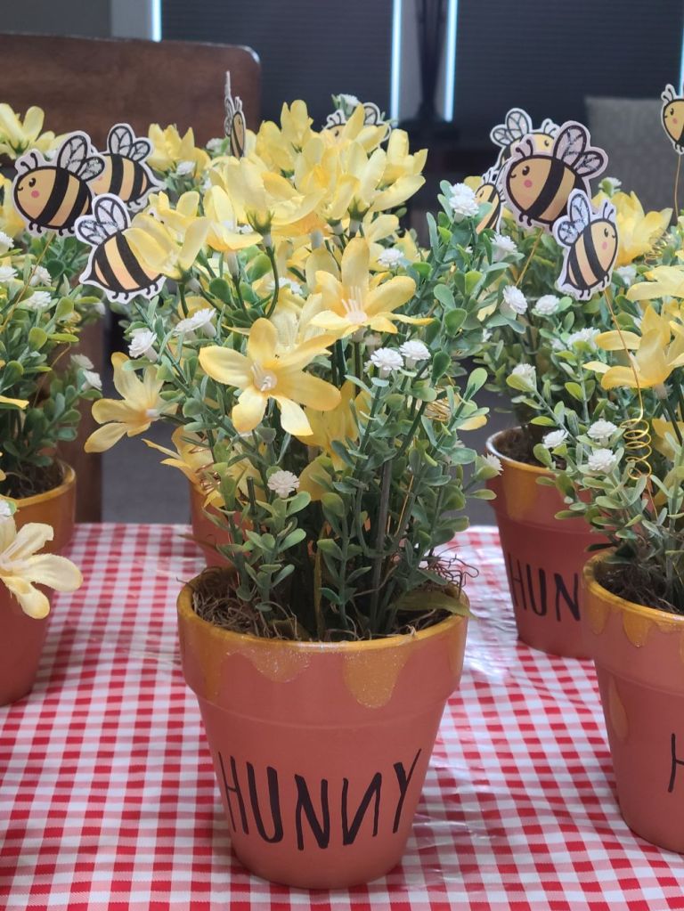
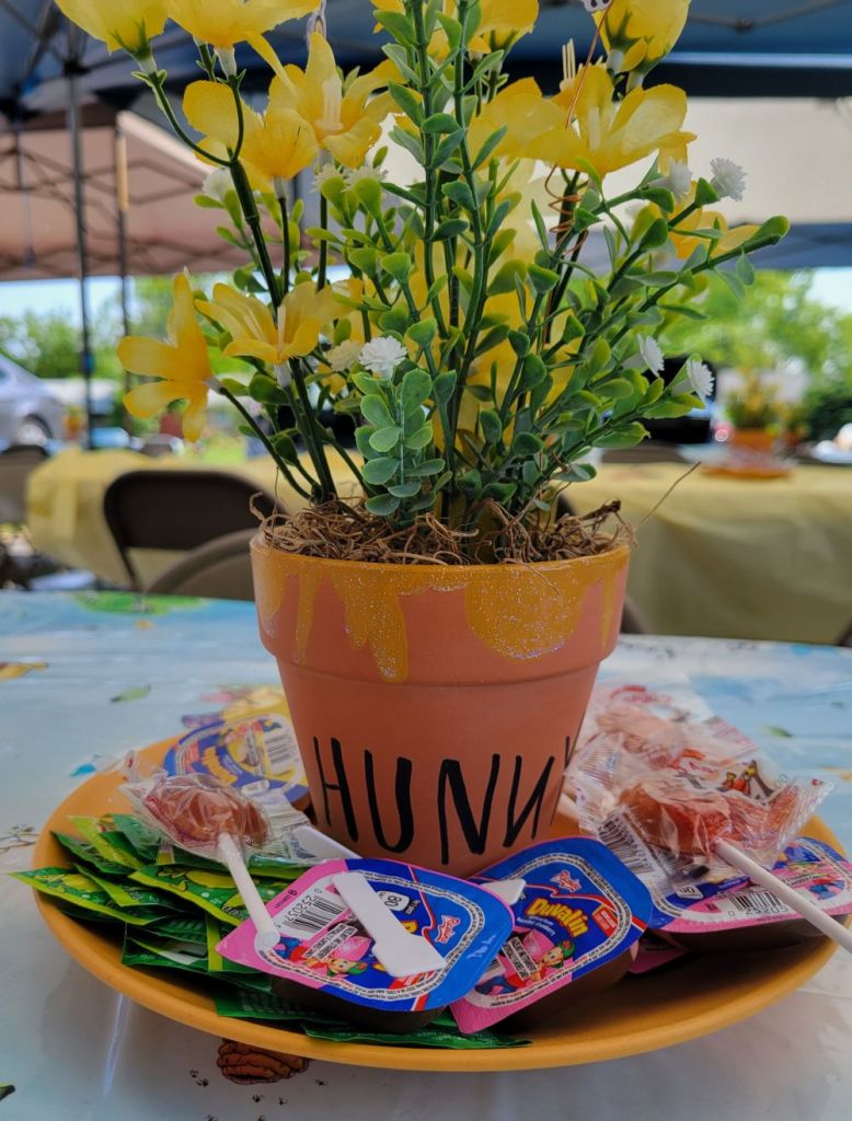
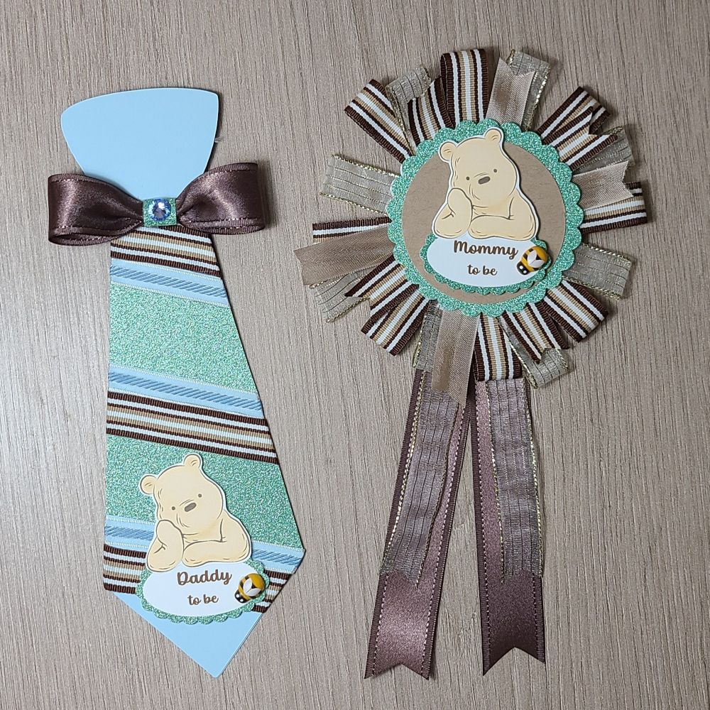
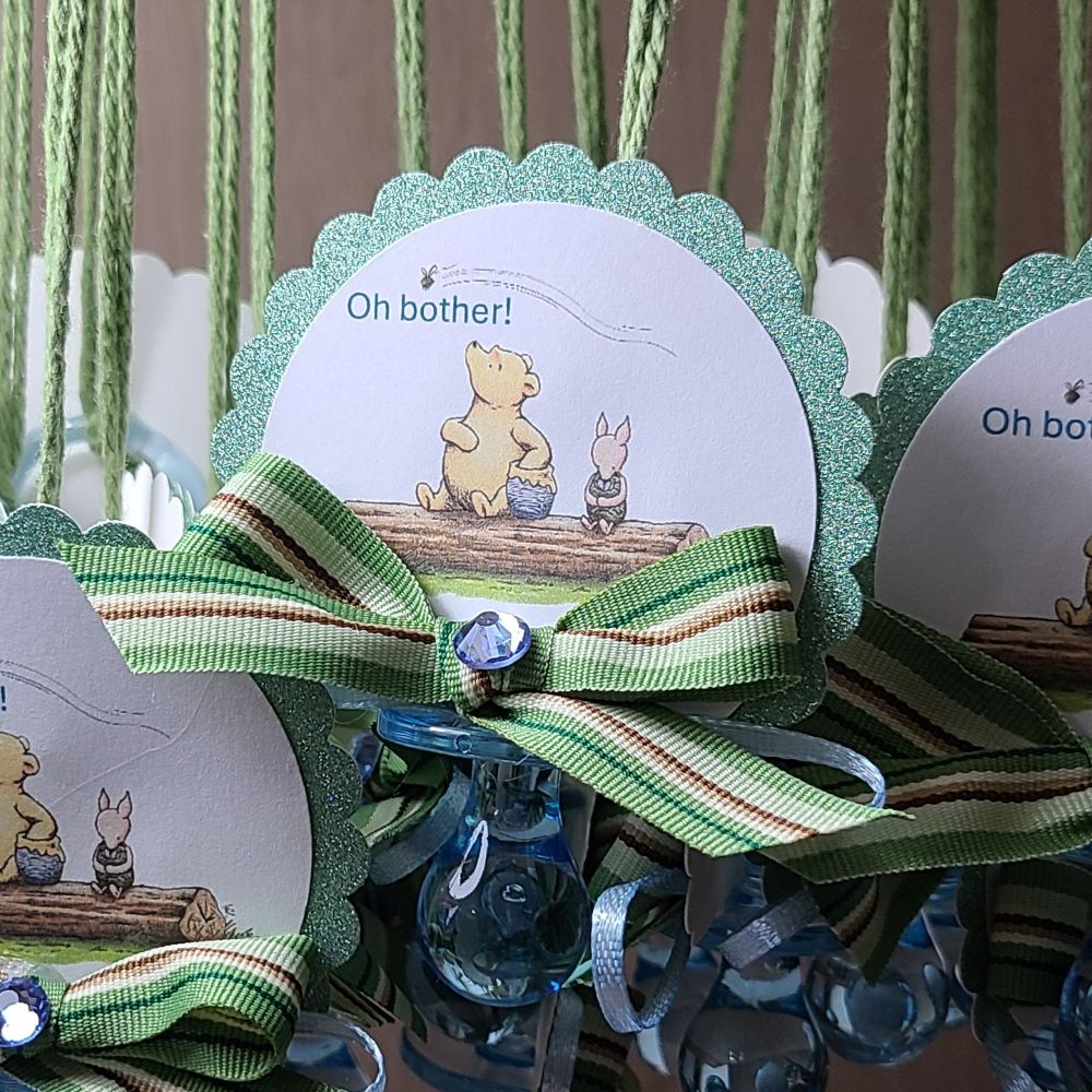
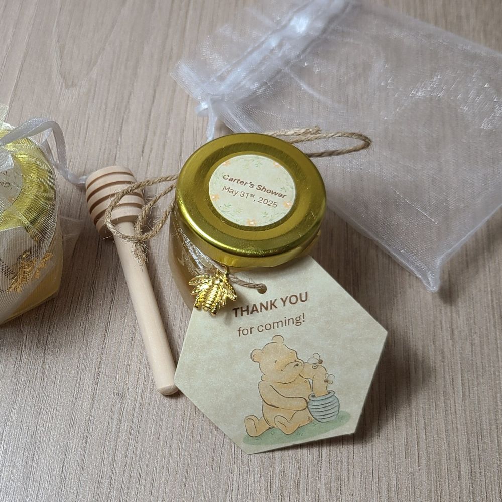
Winnie the Pooh Baby Shower

Hello friends!  Last month was a very busy month for me and I know that I had mentioned a couple of times that I had some things that I was working on “behind the scenes”, so I thought I’d share what I’ve been doing.

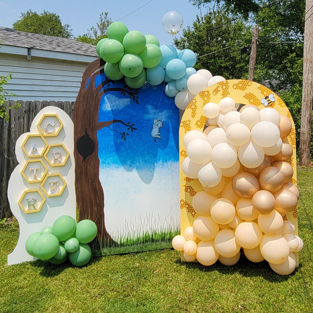
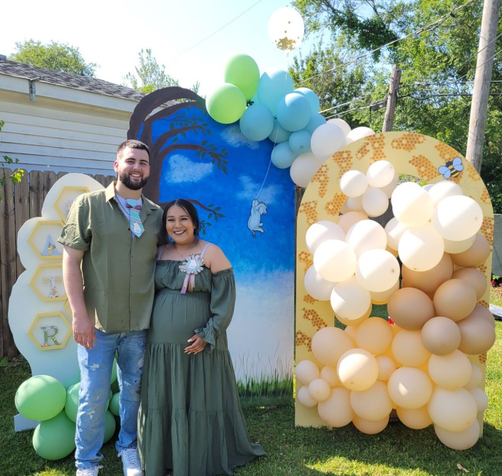
At the end of last year, my son surprised us with the news of a new grandchild coming!  A few months ago, I was asked to help with some decorations for their baby shower and of course I wanted to help!  Here’s a photo of the soon-to-be parents in front of a back drop that my husband cut out and I hand painted.  My husband and I also put together the balloons around it:

You may also notice, on the couple, they’re wearing a corsage that I made for each of them to wear.  My son wasn’t too thrilled about wearing it, but he humored his mom.  LOL

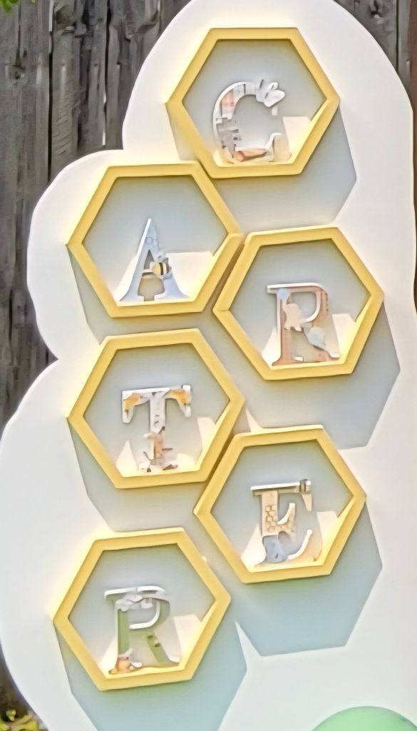
On the left white panel, There are hexagon shelves that my husband put together and there are wooden letters of the baby’s name.  I decorated each of the letters with Winnie the Pooh papers and characters.  I wish I had taken a better photo of them, but I tried to zoom in a photo with the gallery below.

You can see how tall each of the panels are.  My son is over 6 foot tall.  I don’t paint much, so painting something this large was a big undertaking, but I enjoyed the labor of love doing all of these things for them.

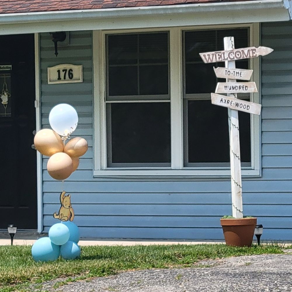
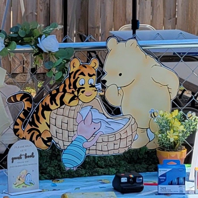
  • Below you can see all of things that I’ve made for the baby shower and there is a brief description with each photo explaining what it is.  If you are on my website, please click on each photo to enlarge it and scroll just beneath it to read the description:

They put in so much work having this baby shower with lots of food, yummy desserts and drinks.  I know with all of the set up and cleaning up they were wore out!  We were also wore out when it was finished up.  LOL  Now it’s just the waiting to meet the newest member of the family by the end of this month.  We are certainly looking forward to it!

Hope you’ve enjoyed my post today…and now you can see why I’ve had “BEEs” on my mind lately! LOL  Thanks so much for stopping by!

GDT for Creative Artiste Mixed Media Nov Challenge – Autumn Teapot

**THERE WILL BE TWO POSTS FROM ME TODAY.  THIS IS THE FIRST POST OF TWO**

Hello friends and happy November!  The weather has finally decided to give us a bit of a cool down and it feels more like that Autumn Season right now.  We’ve been waiting on some rain as it’s been dry and then the wind blew in some cool with it too!  I always like to give Autumn it’s “due justice” as it never seems to have a spotlight as much I think it should.

I’m very excited to share a mixed media project I made for a guest design spot (that I had won a top spot from a previous challenge).  I was asked to join this month as a guest designer for the Creative Artiste Mixed Media Challenge Blog!

The theme for these monthly challenges is always “Anything Goes Mixed Media“.  So be sure to check out the wonderful inspiration from the team and share your mixed media project over there!  I look forward to seeing your inspiring makes!

I’m always excited when I have an “excuse or reason” to get out all of my mixed media things and play around to make something!  I thought since it was November, it would be a great time to pull out the Autumn media:

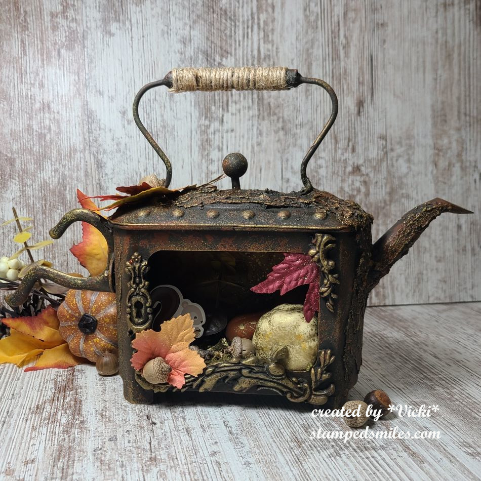
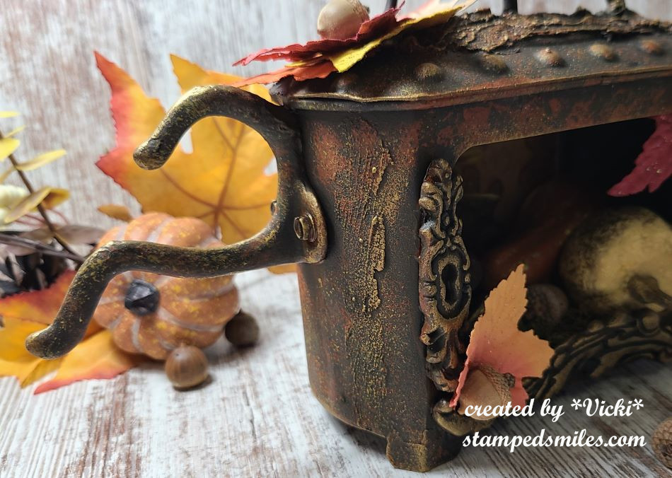
I made this fun center/accent piece for Autumn and pulled out the cool Finnebair rusty metal teapot from my shelf to finally decorate on!  It actually looks pretty cool by itself, but I had to add some other details to it that I thought would make it my own.

For the base:  The only thing that was missing for me was a “handle” for my teapot and I went through my husbands things and found an old metal coat hook that I had him screw onto the side.  I also had some extra pieces laying around from the molds I made with resin, so I attached those along the frame opening with 3D matte gel.  I wanted to also add some texture to my teapot and that’s where I added some crackle paste in various areas…all of these things had to dry for quite some time.  It didn’t look pretty at that point as those pieces were white. LOL  The “hurry up and wait” had begun.

After the long drying time:    I started by covering the entire thing with two layers of black gesso so that all of those white areas were completely covered up.  I pulled out some acrylic paints in Raw Umber, Burnt Orange and very light touch of Marigold.  I started with the darkest color first and did not use a brush to apply the layers.  Instead, I used a sponge after each layer was dry.  I very lightly and sparingly used the yellow.  I even went back in with the Burnt Orange and Raw Umber to get the look I was wanting.

After all of the painting, I used more of the 3D matte gel and wrapped some jute/rope around the top handle.

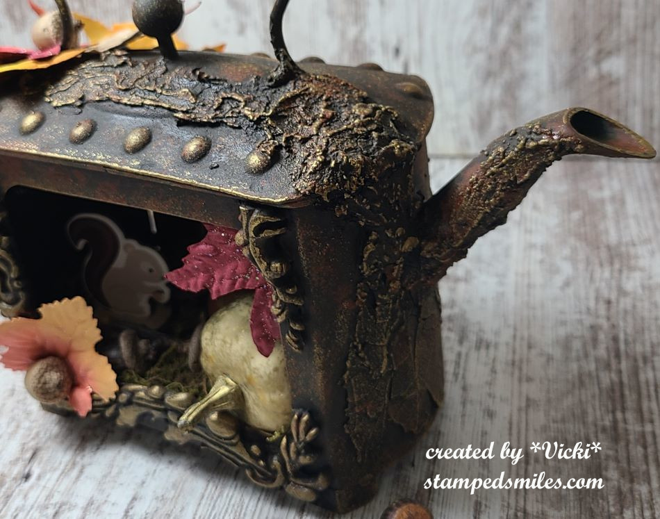
Going to the right side of the teapot, you can see where I’ve added all of that crackle paste and the painting that I’ve done over it.  The only thing missing at this point was the “highlights” to make it look like a found rusty metal teapot.  Since it was Autumn themed, I pulled out the Finnebair Vintage Gold Wax and rubbed over the raised areas with my finger.  You can see the look it gives over the paste and decorative molds around the frame and even the raised “dots” along the top of the teapot.

Moving over to the left side of the teapot, you can see where I’ve screwed in the metal hook to the side of the teapot.  I just incorporated the silver screws with the design by adding paint.  I told my husband that I thought it looked cool to turn the coat hook up-side-down as it looked more like a handle.

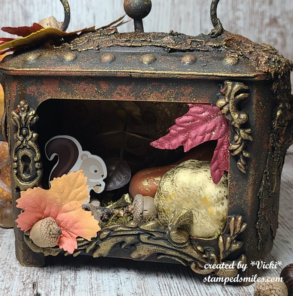
And now if we take a closer look to the inside of the teapot frame, you will see an Autumn scene in there.  The back of the teapot comes out so you can decorate how you’d like.  I know it’s a bit hard to see in the photo, but I found some leafy background paper to attach over the metal backing and I also splattered some gold paint over it.

For the bottom of the teapot, I attached some woodland moss mixture with 3D matte gel and also used it to attach the gold splattered gourds, eucalyptus, a wood slice, a cardboard squirrel, sticks and some acorns.  I also went around the outside areas to attach some Fall leaves and more acorns.  The only thing I didn’t have in my stash were the acorns and sticks.  My husband said that he could get them for free…and of course he went to our local park and picked them up! LOL  So those are the only “real” things on my teapot.

I had thought about maybe adding some fairy lights inside at the top so the inside would be more visible, but not sure if I would like that or not…what do you think?

And in case you might want to know, the measurement of the teapot are 12″ across (including the added metal coat hook), 8″ tall and about 3.5″ in depth.  I currently have it sitting in my cabinet at home.

I hope you’ve enjoyed my mixed media teapot!  I would love to see your mixed media project as well if you play along with us this month at the Creative Artiste Challenge Blog!

Thanks so much for stopping in!  Stay tuned as I will have another post coming up in a couple of hours!

Challenges: (if this project doesn’t fit with your challenge, just delete.)

  1. Ally’s Angels Anything Goes
  2. 613 Avenue Create – October Anything Goes with optional: lots of leaves (Fall/Spring)
  3. Dragonfly Dreams – October Anything but a Card
  4. Krafty Chicks – #740 Anything Goes
  5. Classic Design – #10-2024 Anything Goes with optional twist:  Anything but a card
  6. The Creative Crafters – #81 Anything Goes
Mix It Up With Veggie Stamping!

Hello friends!  Happy July!  I can’t believe that June is gone and the 4th of July Holiday is gearing up now!  I’m looking forward to some happy times ahead through the Summer and I hope you are too!

Today begins a new challenge over at the Mix It Up Challenge Blog and it’s always “Anything Goes with an optional theme“.  For the optional theme this time, we’d like to see some “Veggie Stamping“! (In other words:  use vegetables as your source for stamping with!)  I’ve never done it before, but I gave it a try!  Here’s what I came up with:

Now I’ve heard of people carving food as art, but I don’t think I’ve ever really seen anybody actually use vegetables/food as a stamp!  Have you ever tried this?  I encourage you to give it a try and join in the challenge with it because it was so much fun to play!

For my vegetable stamping, I didn’t want to use ink pads in fear of contaminating/ruining it, so I decided to use some acrylic paints instead.  I grabbed some veggies from the fridge along with a plate to hold the paints and cut the veggies to dip into the paint piles.  My husband decided to come around and snap a photo of what I was doing, so I thought I’d share my mess:

I was actually in the process of cutting out the “veggie flowers” when he took the photo, but I started with some acrylic paper because I was using paints and cut the paper large so I had plenty of room to play around.  It was a bit of trial to figure out how each veggie would look.  I thought it worked best to dry out the veggies as much as possible on a paper towel.  The coral large flower came from the red pepper.  I found that using a paint brush to apply it to the veggie was a better look.  Then I dipped the celery end to make the purple flowers.  The shallot was used to create the teal flower (the shallot was applied the same as the pepper) and I used the end of the carrot for the center of the flowers with yellow paint and then I used a broccoli to dab on the center of the flowers as well with some dark grey paint.

I then tried to arrange the flower bouquet how I wanted on my card base after cutting out the flowers.  I took a paint brush with (no kidding) celery green colored paint and painted the stems coming from each flower.  For the “leaves”, I used the same paint and dabbed the celery end around the stems.

I finished out my card by stenciling the brick background before attaching the cut out flowers.  I popped some of the flowers up with foam tape and then I white heat embossed a sentiment over dark grey cardstock and popped that up over the bottom of the bouquet.  This was attached to another panel of grey cardstock that I attached to a top folding white A2 card base.  I topped it off with a few gems.

  • So what do you think?  First time trying it out and just playing around having fun is all!  A little abstract for sure, but hopefully they do look like flowers on here🏵️!  I’m really looking forward to seeing what everyone does with this!  Hope you can play along too! (Remember you have 6 weeks to enter!  So plenty of time to play!)

THANKS SO MUCH FOR POPPING BY TODAY!  HAVE A GOOD ONE & I’LL SEE  YOU SOON!

Challenges:

  1. Addicted to Stamps & More – #471 Make Your Mark(I used paint)
  2. Little Red Wagon – #762 Layer It Up (I cut out flowers to layer on top)
  3. Simon Says Stamp Wednesday – Anything Goes (Used a MFT stencil)
  4. CRAFT – Anything Goes
  5. Just Us Girls – #733 Stencil Week(Brick stencil)
  6. Creative Fingers – #281 Anything Goes
March Art Journal Page-You Just Have to Ride

Hello friends!  We are at the end of March, and it happens to also be Easter weekend as well this year!  So happy Easter and I hope you’re enjoying the beginning of the Spring season!  I will be out as this post goes up, but I wanted to get in this month’s AJ page!

It’s time for the monthly Art Journal Page collaboration with my crafty friend, Carol (from Crafty-Stamper)! We get creative trying to use up our never-ending stash piles along with a prompt for each month.  I know she always has great inspiration to share, so please check out her blog too! Here’s my AJ page with the “SMASH OUR STASH” March prompt of “POSTAL”:

For this month’s theme, I knew I had lots of real postage stamps in my stash and some ephemera pieces as well as some postal tissue wrap from Tim Holtz.  I have a huge roll of it and it was time to get it back out and use it up!  When looking for my postage stamps, I also found a post card that I previously created and a vintage looking photo that I printed out…which I also turned into a very large postage style stamp.  

The top of the page says:  “Some days you just have to ride, however difficult it might be!

For the Background:  I used an 8.5″ x 5.5″ piece of acrylic paper with pre-punched holes at the top and blended some media paints over the background which gave me the bright blended colors.  I ripped pieces of the Tim Holtz Postale Tissue Wrap and attached with matte medium over the blended paint background.  After it was dry, I ripped some more of the pieces and sanded the edges.  I also took some ” Rusty Brown” wax and went over the textured areas and around the edges with my finger.  Then I splattered some white paint over top.  

I popped up the pre-finished postcard and also added some ephemera around it and added that Shetland pony postage stamp.  I thought it went well with the vintage photo that I turned into a postage stamp with a die.  The quote at the top was printed on my computer, ripped edges and sponged with brown ink.

This is a bit busier in design than what I had planned it to be, but I had fun playing with it and I was glad to use up some more of that piled up ephemera!  I hope you got a “KICK” out of it too! 🫏 Thanks so much for stopping by and I’ll see you soon!

Challenges:

  1. Art Journal Journey – On All Fours
  2. Love to Scrap – Anything Goes
  3. Creative Artiste – Anything Goes Mixed Media
  4. Simon Says Stamp Wednesday – Anything Goes

Art Journal Journey Inspiration-Letting Go…

Hello friends!  Hope that your week has been off to a good start.  We are closing up February, but there are still a couple of days left if you’d like to enter the Art Journal Journey Challenge that I’m hosting this month with the theme of “LIGHT“.  It has certainly been a journey as I’ve never created that many pages within a month’s time!  I did have fun on this journey as it also helped to push me to try a few different things that I can take me with as I continue to art journal.  Thank you to everyone over there for having me as host for this month and to those that have played along, as I have really enjoyed all of the fabulous inspiration!

For my last page, I challenged myself to try something I don’t feel comfortable with:

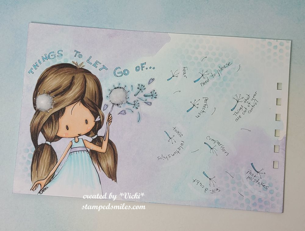
Sometimes as hard as it can be, you just have to let it go.   I let go the fear of hand lettering and drawing for this page.

For the Background:  I’ve got a piece of canvas paper 5.5″x8.5″ that was pre-punched on the right side with my Zutter machine.  (I like this canvas paper because it takes paint really well and the texture does not interfere with making the writing wonky.)  I took my favorite colors turquoise and lavender paints that were extremely watered down to cover the page with.  I was going for very light colors with a flow that blended together.  Once dried, I took some light blue ink and stenciled in certain places.

For that cute little girl that I found on my computer from Tiddlywinks, I printed her out rather large to fit on my page and colored her with Copic markers.  I printed an additional image over a piece of vellum and cut out the dandelion seeds and hearts and attached that portion to the girl image I colored.  I did this so that you could still see the background.  Once I’ve attached her to the page, I cut a piece of cotton ball and glued it to the dandelion weed and the one in her hair.  (Cotton is pretty light!)

Lastly, I took a deep breath and used a pen to write the title above her head as well as all of the dandelion seeds floating around with the words.  I used a white paint pen to make an underline around the words as if they’re flying through the air.  I filled in the lettering with a blue gel pen.

  • I hope you’ve enjoyed my page today and found some inspiration with it.  I also hope you’ve enjoyed my journey this month with art journaling too!  Thanks for stopping in!

Challenges:

  1.  Art Journal Journey – LIGHT/KEEPING IT LIGHT
  2. My Time to Craft – Create Your Own Background (paints, stenciling, drawing)
  3. We Love to Create – Anything Goes Mixed Media

Art Journal Journey Host for February

Hello friends!  I have some really exciting news to share today!🎉  I’m so honored to have been asked to host this month’s challenge for  ART JOURNAL JOURNEY!  The winter months can be not only very cold over my way, but dark days with less sunlight hours can really take a toll sometimes.  I’m always searching for something at this time of the year and so I thought it only appropriate to help with that for this month…

The theme that I have chosen for this month is “LIGHT“.  Light can have so many different meanings and so many different ways to interpret it.  Here are a few examples to get you thinking:
1. sun, moon, stars, candle. lantern, bulb, illuminate
2. colors (subtle or subdued tones or shades)
3. an idea (‘shedding some bright light on a subject’)
4. interpretations (light as a feather, light snowflakes, let your heart be light, let your light shine, etc)

* Please be sure to catch the rules to enter on the left sidebar of the challenge blog* 

Here is my starting inspiration for this month’s theme:

I’ve started my page with a 5.5″x8.5″ canvas paper with pre-punched holes at the top using a Zutter machine. 

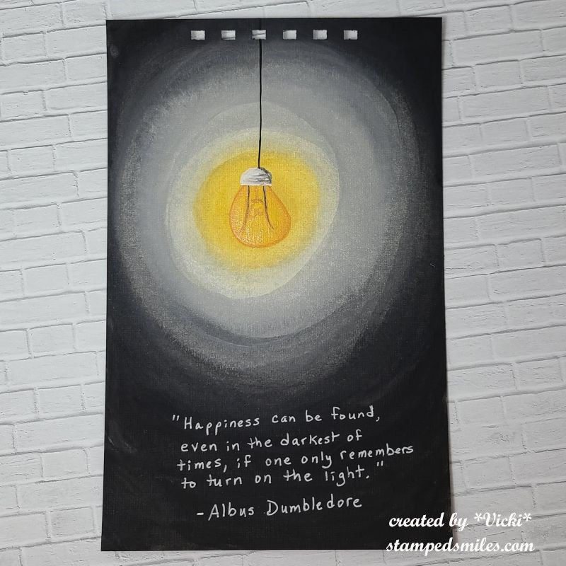
For the background:  Pulling out a white, black, grey, yellow and light yellow acrylic paints, I found the center point where I wanted it and painted my yellow spot.  I worked with each color while it was still wet to help it blend together.  I worked outward with the light yellow, then white, then grey and finally the black.  Some of it needed to blended in with the next color, so I just worked it back and forth until I got the look I wanted. 

After the blends were dry, I used the detail brushes to create the light bulb and cord.  I drew/painted the lightbulb in the center of the yellow and worked around from there and lastly added my black cord hanging down.  It’s hard to tell in the photo, but I covered the bulb with a glitter brush pen application to give it sparkle.  (I have never done a page that was completely hand painted…so this was a challenge for sure!)

The Dumbledore quote was added with a white gel pen.  One of my favorite quotes.

  • I hope you enjoyed my approach to the “LIGHT” theme and you’ve been inspired to create something in your art journal today!  I can’t wait to see how everyone interprets it!
  • I will be posting several art journal pages throughout the month with this theme, so please be sure to stay tuned in to see more inspiration with it!

I’m sure you’re used to seeing only one monthly art journal page from me, but this month will be filled with several of them throughout and I hope it helps inspire you to bring some LIGHT to your creation in some way.  

Hope you have a brightly filled day!  Thanks for dropping by!

Challenges:

  1. Crafting from the Heart – Anything Goes
  2. We Love to Create – Anything Mixed Media/Paper Goes
  3. Creative Fingers – Anything Goes
  4. Penny’s Paper-Crafty- Anything Goes

September AJ Page-Thankful Imprint

Hello friends!  Can you believe we’re already through September?!  Today is a scheduled post from me as I’m away in an area with spotty to no connection right now, but wanted to be sure that I had my Art Journal Page posted for this month.

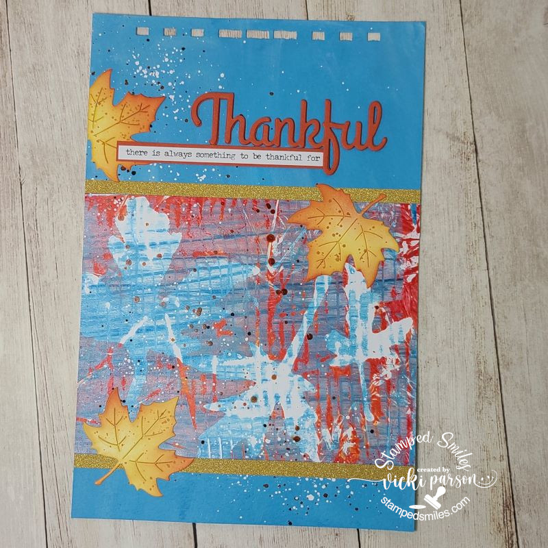
It’s also hard to believe that this is the 9th page done for this year!  I’m so glad I’ve done the monthly Art Journal Page collaboration with my crafty friend, Carol (from Crafty-Stamper)! We get creative trying to use up our never-ending stash piles along with a prompt for each month.  I know she always has great inspiration to share, so please check out her blog too! Here’s my AJ page with the “SMASH OUR STASH” September prompt of “IMPRINT” (using gel plate, print machine, leaves or something to create an impression):

Really had a fun time with this as I hadn’t gotten a chance to play around with my gel plate very much and I received about 15 different prints in one sitting!  It started out like I didn’t have a clue, but the more I kept experimenting, the more fun and unique prints came out.  Do you have a gel plate and/or do you use it often? (If you’re new to Gel Printing, here’s a link to a You Tube video showing you basics on how to get started The Basics of Gel Printing)  

For my print here, I decided to try something from nature and found a couple of maple leaves in my yard that were laying on the ground starting to turn.  I think there are about 3 layers of prints on this one…hard to remember when you just keep going!  I cut it out to fit the size of my AJ page.

FOR THE BACKGROUND – I started with my usual 6″ x 9″ Canson 140# cold pressed watercolor paper with pre-punched holes at the top and covered it with DecoArt media fluid acrylic Primary Cyan applied with a baby wipe.  Really love the blue background it gave here.  Then this is when I applied the gel print piece to my background.  I then used some orange, black and white colored acrylic paints to create some splatters over the background and gel print piece.

I die cut some maple looking leaves from the Taylored Expressions Garden Variety-Fall die set and ink blended them.  I also splattered some orange paint over them as well.  I had some gold glitter sheets that I cut down in a couple of thin strips to add to the top and bottom of my gel print piece.  I then attached the die cut maple leaves.  

I cut out the word “Thankful” from Impression Obsession three times in Pumpkin cardstock and layered them together for my page.  I also grabbed this sentiment from the Tim Holtz small talk stickers and layered it over the same Pumpkin cardstock and attached it next to the “Thankful” word on the page.

I thought about adding something more, but I then thought it would distract from the printing which already has a “busy” look to it and so I called this one done.

  • I’m very THANKFUL that you’ve taken the time to stop by and your kind support!  It’s always more fun to craft with like-minded friends!  I’m also THANKFUL to my crafty friend Carol for sharing this monthly AJ fun with me as well!  (I will stop by to see your page as soon as I can my friend!)

Have a great day and see you in October! 😊

TO LEAVE A COMMENT:

  1. Start typing in the comment box below each post you’d like to comment on and leave whatever message you’d like. 
  2. Once you start typing within the box, you will see 3 buttons show up with the options: “W” for WordPress icon, “F” Facebook icon and an “envelope” icon.  Choose one of these buttons in which to “login” or enter your name/email because this blog doesn’t allow anonymous comments.
  3. If you’re a Gravatar.com user, then you can click on the “W” button to sign in which will automatically show your profile photo and a “gear” button next to it.  If you already see your profile photo showing up, then all you need to do is leave your comment and hit the highlighted reply button.
  4. If you’d like to just enter your name and email (email address is not published), then click on the “envelope” icon.  Once you’ve done that, the “reply” button should be highlighted so that you can leave a reply.  Hopefully, once you’ve left your comment, it will “remember” who you are the next time you visit, and you won’t have to keep entering your information. **If you’re already logged into WordPress, this option WILL NOT work.  If you see your Gravatar profile with a gear next to it, you are ready to leave a comment.

*****If you are NOT seeing your comment appear immediately after you’ve left your comment and hit the reply button, I may have to “approve” your comment.  But once I’ve approved you, you shouldn’t have to be approved again unless you’re leaving several links within your comment.

I hope this helps!  Sorry if you’re having a problem leaving a comment and I really appreciate you taking the time to support your kindness with me!  BIGGEST HUGS

Facing Fear With Art Journaling

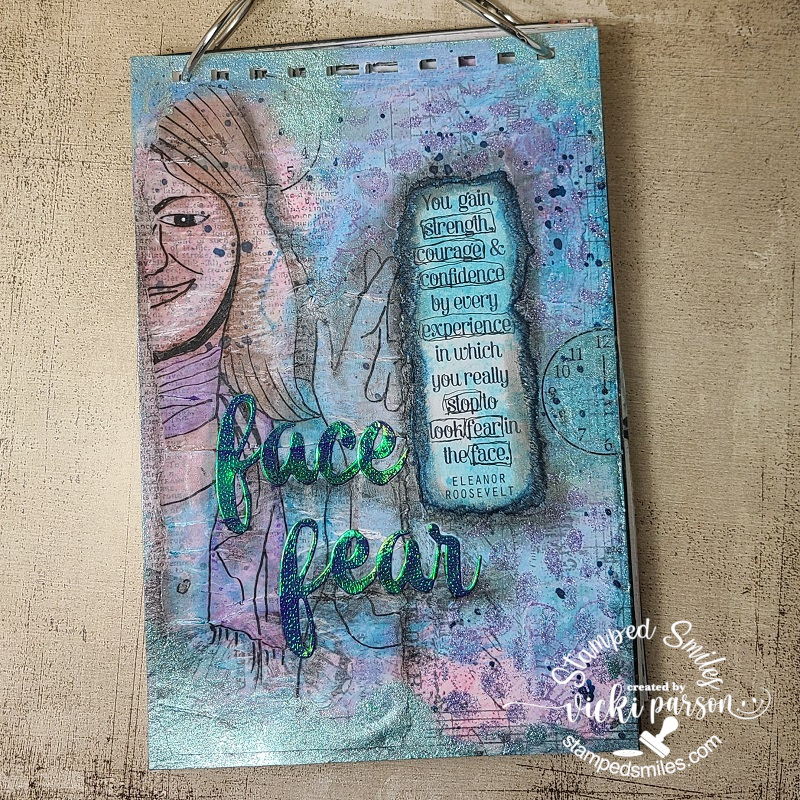
Happy weekend!  Hope you’re weekend is going great!  I’ve been wanting to start doing some art journaling again because I used to do lots of it years ago on a previous blog I had before this one.  The only one I had recently done was in 2020 on THIS POST.  For me, creating AJ pages gives the freedom to “explore” different media, use more of my stash or even TRY things that I would never do otherwise.  I’m always inspired with other people’s AJ pages, but just need to start doing it again!  It’s nothing that I would ever give away, it’s just something for me personally to create.  I find it’s a HUGE stress reliever too!

I’ve decided to play along with a couple of challenges.  (shown below post) One was about “adding a face” to your AJ page and something that I decided to do was to actually trace half of a face over some vellum paper. (I used a micro pen for tracing) I don’t draw anything at all…which is why I love stamps!  So, I had a go at “facing fear” to start this year with an AJ page!

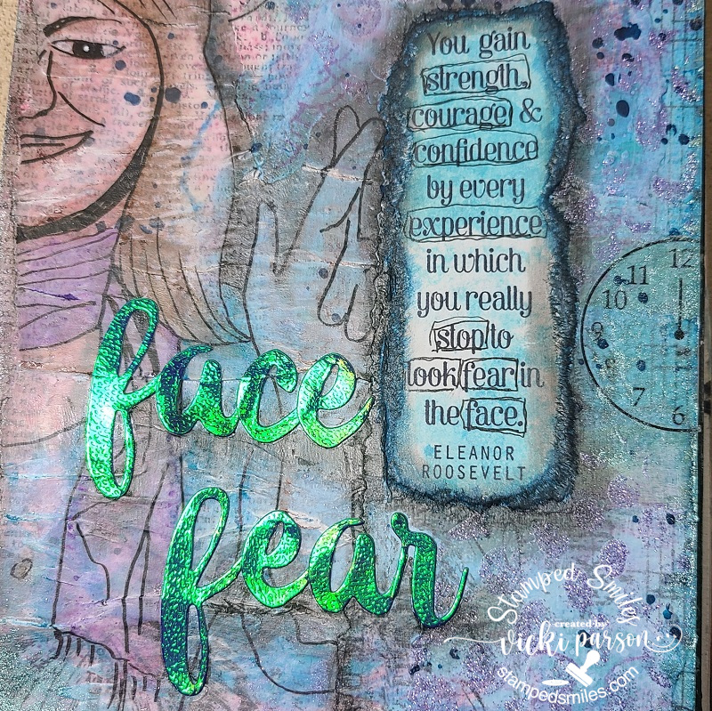
As you can see, I’m making my own AJ book and there are actually 7 other finished pages underneath this one. These are the pages I had previously done and hadn’t kept up on my book.  The size is 6″ x 9″, and I always punch the holes at the top before I get started putting anything on it. (I’ve used heavy weight watercolor paper) I wanted the face tracing to “show through” what was underneath, so I took ripped up strips from left over collage pieces I had previously made, I also added some text print and acrylic paint colors over it.  I’ve used DecoArt media fluid acrylics to blend colors and DecoArt media shimmer mister for some splatters.  I’ve also taken a stencil with some Taylored Expressions purple glitter Happy Medium gel paste in certain areas.  Once I’ve gotten the background build up a bit, I layered over the face tracing.  I wasn’t really happy with the crackling of the vellum, but it added some fun texture.

I also took one of those ripped collage pieces and stamped the quote from Eleanor Roosevelt with Archival Black ink and layered next to the vellum face with matte medium.  And since I’ve used matte medium to attach all of my elements, I took out my Faber-Castell Pitt big brush markers to add some color to the vellum tracing, around the edges of it and around the edges of the ripped stamped sentiment.  I took some foiled cardstock and die cut the “face fear” letters from an Altenew die set I had in my stash.  I also added some shading with my markers under the letters too.

In the close-up photo, you can see the bits of sparkle and shimmer on it a bit more!

Some of the words in the quote were doodled around using a micro pen.  I had a rub-on clock face in my stash, so I rubbed half of it on one place, moved it and rubbed the other half in another spot so as not to waste it.  I thought I needed to add a bit more shimmer, so I took some Art Alchemy Sparks acrylic paint and brushed it on randomly in places.  I love the pretty shimmer of this paint!  (You can really see it around the edges in the top photo)

Something a bit different from me today, but hope you’ve enjoyed it or been inspired in some way!  I’m hoping to try to create a page each month.  Thanks so much for stopping by and have a great rest of your weekend!

Challenges:

  1. *Art Journal Journey – Let’s Face It!
  2. Country View – A Year to Sparkle & Shine
  3. Mixed Media Lovers – Anything Goes Mixed Media
  4. Try it On Tuesday – Add a Quote