Hello friends! We are at the end of March, and it happens to also be Easter weekend as well this year! So happy Easter and I hope you’re enjoying the beginning of the Spring season! I will be out as this post goes up, but I wanted to get in this month’s AJ page!
It’s time for the monthly Art Journal Page collaboration with my crafty friend, Carol (from Crafty-Stamper)! We get creative trying to use up our never-ending stash piles along with a prompt for each month. I know she always has great inspiration to share, so please check out her blog too! Here’s my AJ page with the “SMASH OUR STASH” March prompt of “POSTAL”:
For this month’s theme, I knew I had lots of real postage stamps in my stash and some ephemera pieces as well as some postal tissue wrap from Tim Holtz. I have a huge roll of it and it was time to get it back out and use it up! When looking for my postage stamps, I also found a post card that I previously created and a vintage looking photo that I printed out…which I also turned into a very large postage style stamp.
The top of the page says: “Some days you just have to ride, however difficult it might be!“
For the Background: I used an 8.5″ x 5.5″ piece of acrylic paper with pre-punched holes at the top and blended some media paints over the background which gave me the bright blended colors. I ripped pieces of the Tim Holtz Postale Tissue Wrap and attached with matte medium over the blended paint background. After it was dry, I ripped some more of the pieces and sanded the edges. I also took some ” Rusty Brown” wax and went over the textured areas and around the edges with my finger. Then I splattered some white paint over top.
I popped up the pre-finished postcard and also added some ephemera around it and added that Shetland pony postage stamp. I thought it went well with the vintage photo that I turned into a postage stamp with a die. The quote at the top was printed on my computer, ripped edges and sponged with brown ink.
This is a bit busier in design than what I had planned it to be, but I had fun playing with it and I was glad to use up some more of that piled up ephemera! I hope you got a “KICK” out of it too! 🫏 Thanks so much for stopping by and I’ll see you soon!
Hello friends! It’s almost Halloween, can you believe?! Today is actually hubby & my 23rd wedding anniversary that we are out celebrating and hanging out having fun right now. So the theme of my page was designed to fit with this in mind today.
Hard to believe that the end of the month is here and also time for a monthly Art Journal page and collaboration with my crafty friend, Carol (from Crafty-Stamper), so please check out her blog for more inspiration too! We’re trying to get creative by using up our never-ending stash piles! So here’s my Art Journal inspiration with the “SMASH OUR STASH” October prompt of “UNUSED MEDIA from stash” :
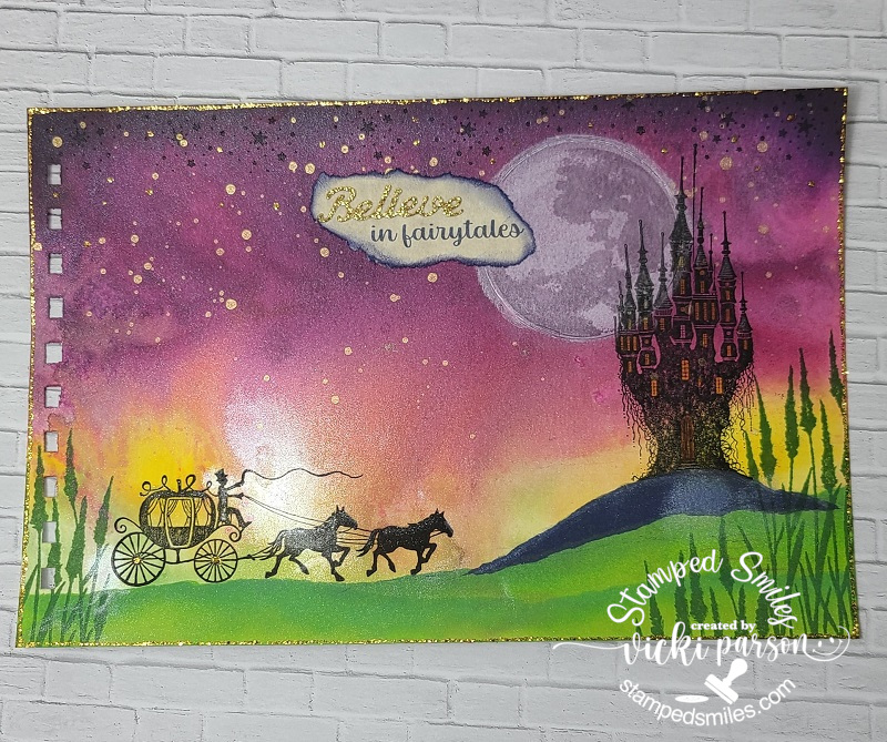
As I was thinking of this month’s prompt, I was checking through my media to see if there was something that I had NOT used at all yet, but for the most part, I have. So, then my thoughts turned to what I haven’t used in quite a while. So, after going through bottles and bottles of liquid watercolor…and throwing several away that were no good…I used some colors to create the background on my page using a 6″x9″ sheet of Bristol Smooth Watercolor paper with pre-punched holes. I added drops of the watercolor on my glass mat, sprayed with water and “smooshed” the paper to create the look I wanted and let dry. I wanted the smooth texture because I knew I was going to stamp over top.
Another media I haven’t used in a while is the Faber Castel Gelatos, which was used to create the moon. I took a circle scrap, traced around it and then scribbled on a white and shimmer white gelato with my finger and rubbed into the areas I wanted. I also pulled out several of the Lavina Stamps which were all used to create the scene over my watercolor background. I had these stamps for quite some time but have never used any of these images. So, I stamped stars at the top, the moon, the castle, the stagecoach and the tall grasses. BEFORE all the stamping, I did use some gold paint to create splatters at the top.
After stamping the images, I took some torn scrap paper and sponged in the “ground” areas for my images.
For the quote, I printed out the “in fairytales” on my computer, added a die cut “Believe” sentiment cut from some gold glitter cardstock and attached it above the computer-generated wording. I tore around this sentiment and sponged in some dark blue around it. I finished off the page with some gold Stickles around the edges and drops randomly over the star areas. I also took a glitter brush pen to add some sparkly highlights to the castle, ground areas and stagecoach.
Hope you’ve enjoyed my AJ page today & been inspired in some way. Thanks so much for dropping in!
Challenges:
Art Journal Journey – Fairytales, Folklore and Fables (Mine is based on the Fairytale Cinderella)
Hello friends and a happy weekend! I really can’t believe that we’re already on the last Saturday of March right now! This month flew by, but I’m so happy to get even further into the Spring months, how about you? The chirping birds seem more intense as Spring gets into her song!
Today I’m sharing my monthly Art Journal page and collaborating with my blog friend Carol as we both try and get creative with journaling by using up our never-ending stash piles! So please pop on over to her blog to see some more inspiration with our “SMASH YOUR STASH” prompt of: “Die cuts/punched out pieces/tags(unfinished to decorate)“! Let’s get to creating!
Well, I don’t know about you, but I sure do have TONS of those punches that I hardly ever use any more. I also keep piling up tons of die cuts too! So this was my focus on my page today by pulling out lots of those to come up with a Spring theme in mind…
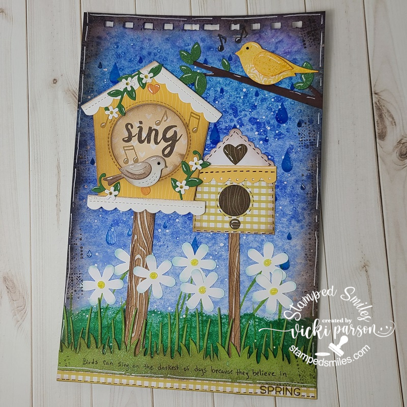
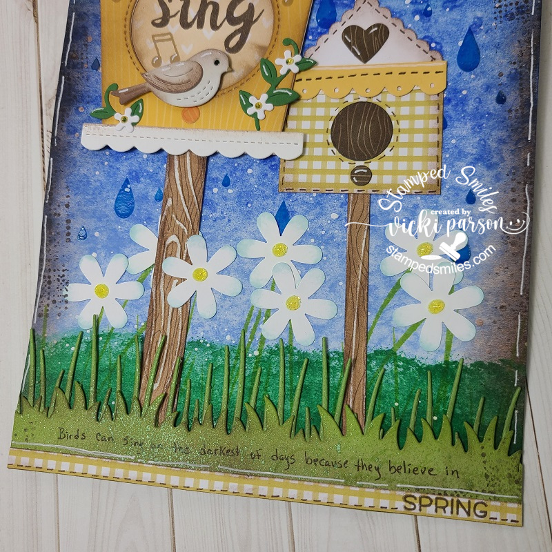
I started out with my usual 6×9 thick watercolor paper with the binder holes at the top. My first thought was to create a blue “watery” background by using my Zig Kuretake Gansai Tambi watercolors to paint an ombre blue. It was nice to pull these out to play with as I haven’t used them in quite a while. While it was still wet, I covered the panel with some Sea Salt crystals and let it dry. After it dried, I scrapped off the salt. If you’ve never tried it, it makes for a really unique look. I then took a raindrop stencil and went over it with some blue Chroma Glaze. I really like how the glaze makes it look shinny. I mixed some blue and yellow Deco Media Fluid Acrylics to make the green color and sponged it over the bottom to create my grass scene. I also had a tall grass stamp that I stamped over it with green ink. Lastly, I used white paint to splatter over the background.
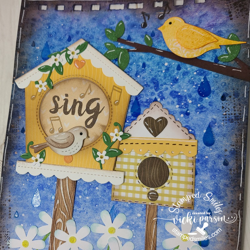
So this is where I moved onto the rest of my separate pieces to create my scene. I pulled out circle, square, heart, scallop border, birds, leaves, flowers, branch, grass borders, etc and began cutting out all of my pieces! The yellow bird at the top was stamped and then punched out. The birdhouse on the right is all punches and the daisy flowers at the bottom are all punches. The larger birdhouse with the bird and flower vines is a die set by Lawn Fawn, the branch and leaves at the top right is a die set from My Favorite Things and I’ve also used a couple of different grass die cut borders at the bottom from My Favorite Things. This is my very first time using that birdhouse die set and I’ve had those grassy border dies forever but use quite often.
I was also quite happy that I was able to pull out several pieces of scrap papers from my stash to punch and die cut all of them too! That’s a good way to use up more of your stash when you’re using punches and dies!
Trying to zoom in a bit so you can see the background and how it looks with the watercolor salt technique as well as the shine from the raindrops. For the birdhouse posts, those are just strips of woodgrain looking pattern paper that I’ve cut into strips and then ran through an embossing folder. I used a sander to bring out the texture.
I stamped the music notes next to the birds and also stamped the “sing” letters in the center of the birdhouse. I’ve got both of the birds popped up with foam tape. I’ve glued the birdhouse posts to the page, but popped up the large birdhouse with foam tape as well. You can also see where I’ve went all the way around the edges and I sponged brown ink around everything. I also stamped a random image around the edges with brown ink too.
At the bottom of the page, you can see that I’ve taken a brown marker to write “Birds can sing on the darkest of days because they believe in” and then I stamped “SPRING” over a strip of pattern paper and attached at the bottom and used the brown marker to create the dash lines. Also did this on my made up punched birdhouse.
Both the last grassy border and the leaves above on the branch were die cut from green cardstock, but I’ve also used some green mica spray and sprayed over top of them which gives a pretty shimmer to them. Before popping up the yellow bird at the top, he was also sprayed with a yellow mica spray.
To finish it off I’ve added all of the white gel pen details and along the edges of the page. Lastly, I used some yellow Stickles to center each of the daisy flowers as well as the flowers on the birdhouse. I used black Stickles to the bird’s eyeballs.
Really enjoyed putting this one together and playing around with more stash items! Hope that you’ve enjoyed as well and have been inspired in some way! I thank you so much for stopping in! Have a great weekend!
Hello friends! Hope that you are doing well and staying warm and safe out there. It’s been a few minutes since my last post, but that’s because I’ve been working very hard making wedding invites! They’re coming together and almost done! At some point I will share those, but today I have an AJ page to share with you! It was nice to be able to take a break from creating invites to turning my mind on making a page.
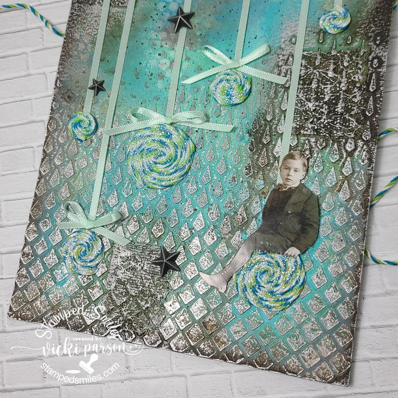
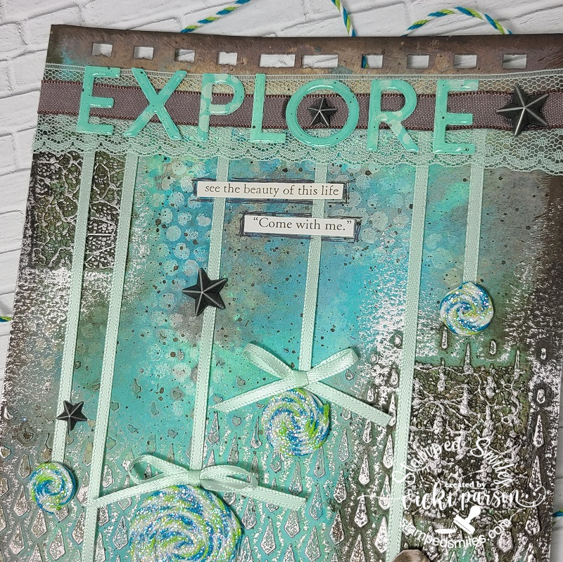
**My crafty friend Carol is joining along with me each month to help inspire us both as well as others and I’m so thrilled to be doing this with her, so please click on her name and check out her page too! We’re coming together as I think we both have an issue with “too much stash”…who doesn’t?!🙄 So I’ve come up with some ‘AJ prompts’ to help us both “Smash Our Stash” to start using it up for our own creative outlets and have some FUN! The month of February gives us the prompt: ribbon/fibers/twine/thread
If you do any Art Journaling, then you know that sometimes when you have something in mind to do, it doesn’t always turn out like you think it will in your head! This is the case with this one! I like how it turned out and really enjoyed the process of it along with feeling good about using up some ribbon and twine overflowing in my stash!
I’m continuing on with making my own AJ book, so I’ve got the holes ready at the top of my 6″ x 9″ 140# watercolor page. I like to use something really thick as I think it helps to hold all of the wet media/paint without it warping too badly.
I’ve started by using a Tonic Studios “Falling Diamonds” stencil with embossing paste towards the bottom and not going all the way up to the top of the page. I then used Salvaged Patina and Mermaid Lagoon Distress Oxide Sprays over top letting colors mix and run. Once dried, I added some sponged white paint over a Tim Holtz stencil. I then took some Ranger Ground Espresso paint and added some paint splatters over it, set aside to dry. Then came my first introduction of the prompt onto my page. I took some left over pieces of lace (in fact this was the last of this piece from my stash…why I kept it? Who knows!!!) and glued it randomly onto the background. Once dried, I added some water-downed Ground Espresso paint over those areas, sprayed with water and let run. I also took the same paint and sponged around the edges to darken them up. After it dried, I took some Art Alchemy “Old Silver” wax and rubbed over the raised areas of the paste and lace with my fingers until it showed up as I wanted it to.
I decided at this point, that I wasn’t going to do what I had planned in my head as I thought the background was going to turn out much lighter and brighter. It turned out more antique/grunge, but I was still happy with it and just changed the plan a bit. I don’t know what these are called, but I named them “Twine Twirls“. I took a double-sided adhesive sheet and covered a piece of cardstock with one side, die cut a couple of different sized circles, took the backing off the other side of the adhesive and used some twine in my stash to continue to swirl around the center of the adhesive circle until reaching the edges. (Do you ever get twine wrapped around one of your craft orders and save it? That’s what all of this twine is from…can you believe I saved them and got plenty more to use?!!) I then took a piece of VERY old ribbon from my stash and attached to the back of each “Twine Twirl”. I laid these over the page where I wanted it and added an adhesive strip at the top of the page right below the holes to secure them as well as glued the back of the circles. You can also see that I’ve attached some bows above 3 of the “Twine Twirls” too. I used some Stickles glitter glue and brushed over top of each “Twine Twirl” and set aside to dry.
I also fussy cut out one of the Tim Holtz paper dolls to glue over one of the “Twine Twirls” and then used some foam tape to pop him up over the page as needed once the glitter had dried.
For the top of the page where I’ve added the “Twine Twirl” ribbons, I took another piece of lace that matched that ribbon and covered it over top of the ends. Since it’s lace, you can see through it, so I layered on another piece of brown taupe ribbon in the center of that. (I’ve used scissors to cut the ends off the page.)
For the lettering, I used some of the items I used for the background page onto a piece of blank cardstock and then cut the letters out using the Taylored Expressions Cap It Off Alpha taking off the frame around the letters. I glued the letters over top of the ribbon and then covered each letter with glossy accents.
The phrases come from a Tim Holtz “Clippings” sticker book and then I took a brown pen to outline around it. I finished the page by adding some of the Tim Holtz stars adornments in random areas.
I really hope you’ve enjoyed our AJ pages today or have been inspired in some way! Be sure to join us next month too! Thank you so much for dropping in and I’ll see you soon!
Challenges:
Art Journal Journey – What’s Your Style? (I love using stencils most of the time but enjoy “exploring” different medias too! Not sure about a specific style…I like them ALL!)
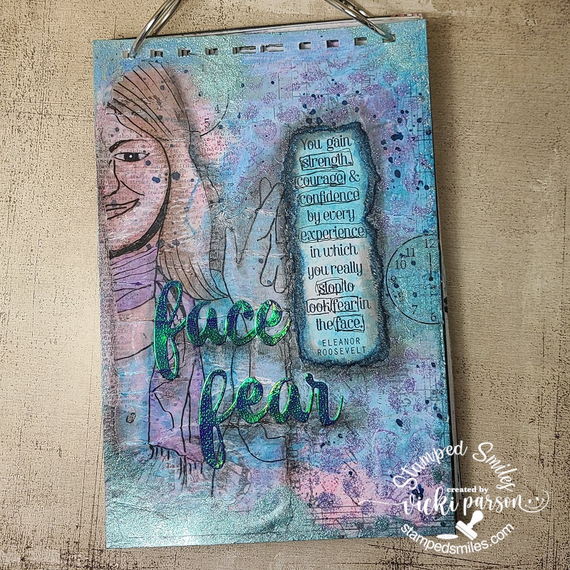
Happy weekend! Hope you’re weekend is going great! I’ve been wanting to start doing some art journaling again because I used to do lots of it years ago on a previous blog I had before this one. The only one I had recently done was in 2020 on THIS POST. For me, creating AJ pages gives the freedom to “explore” different media, use more of my stash or even TRY things that I would never do otherwise. I’m always inspired with other people’s AJ pages, but just need to start doing it again! It’s nothing that I would ever give away, it’s just something for me personally to create. I find it’s a HUGE stress reliever too!
I’ve decided to play along with a couple of challenges. (shown below post) One was about “adding a face” to your AJ page and something that I decided to do was to actually trace half of a face over some vellum paper. (I used a micro pen for tracing) I don’t draw anything at all…which is why I love stamps! So, I had a go at “facing fear” to start this year with an AJ page!
As you can see, I’m making my own AJ book and there are actually 7 other finished pages underneath this one. These are the pages I had previously done and hadn’t kept up on my book. The size is 6″ x 9″, and I always punch the holes at the top before I get started putting anything on it. (I’ve used heavy weight watercolor paper) I wanted the face tracing to “show through” what was underneath, so I took ripped up strips from left over collage pieces I had previously made, I also added some text print and acrylic paint colors over it. I’ve used DecoArt media fluid acrylics to blend colors and DecoArt media shimmer mister for some splatters. I’ve also taken a stencil with some Taylored Expressions purple glitter Happy Medium gel paste in certain areas. Once I’ve gotten the background build up a bit, I layered over the face tracing. I wasn’t really happy with the crackling of the vellum, but it added some fun texture.
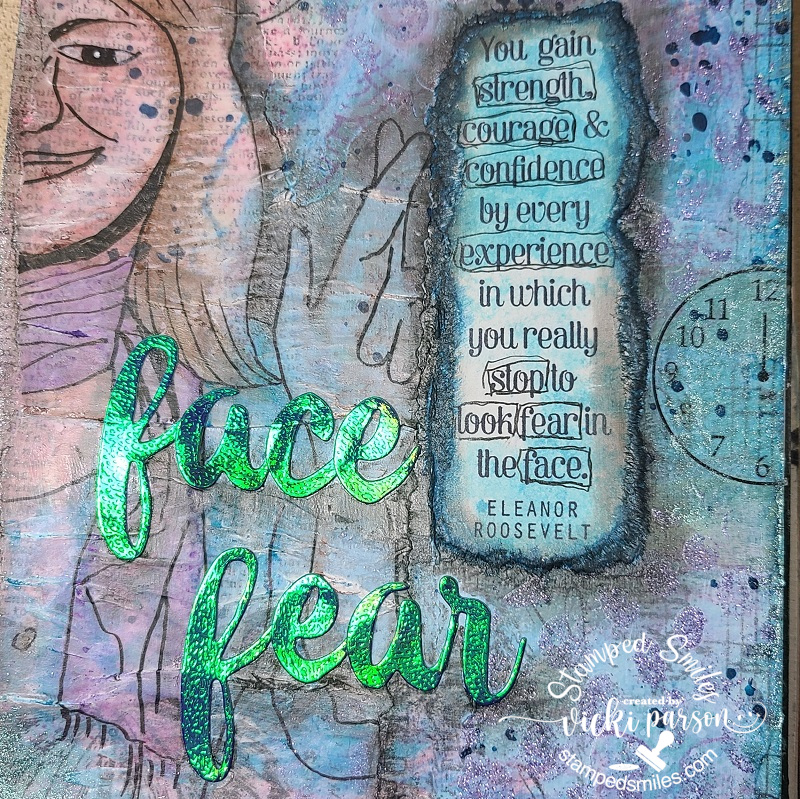
I also took one of those ripped collage pieces and stamped the quote from Eleanor Roosevelt with Archival Black ink and layered next to the vellum face with matte medium. And since I’ve used matte medium to attach all of my elements, I took out my Faber-Castell Pitt big brush markers to add some color to the vellum tracing, around the edges of it and around the edges of the ripped stamped sentiment. I took some foiled cardstock and die cut the “face fear” letters from an Altenew die set I had in my stash. I also added some shading with my markers under the letters too.
In the close-up photo, you can see the bits of sparkle and shimmer on it a bit more!
Some of the words in the quote were doodled around using a micro pen. I had a rub-on clock face in my stash, so I rubbed half of it on one place, moved it and rubbed the other half in another spot so as not to waste it. I thought I needed to add a bit more shimmer, so I took some Art Alchemy Sparks acrylic paint and brushed it on randomly in places. I love the pretty shimmer of this paint! (You can really see it around the edges in the top photo)
Something a bit different from me today, but hope you’ve enjoyed it or been inspired in some way! I’m hoping to try to create a page each month. Thanks so much for stopping by and have a great rest of your weekend!

 We’re trying to get creative by using up our never-ending stash piles! So here’s my Art Journal inspiration with the “SMASH OUR STASH” October prompt of “UNUSED MEDIA from stash” :