Hello friends! I’m hoping that you’ve had a wonderful weekend!
I’m very excited to be sharing my projects today as a guest “Rock Star” for Repeat Impressions! I’ve been asked to share a special post for their “Project of the Week” segment on their blog today! Yay!
If you’ve been following me for a while, then you know how much I love to ink blend! It’s something that is fun to do, and I’m always amazed at the finished colors! I want you to get the same satisfaction when you do it too, so I thought that would take a fun photo tutorial for my guest POTW post!
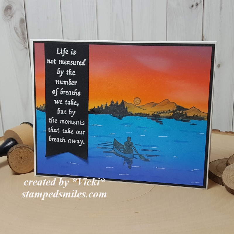
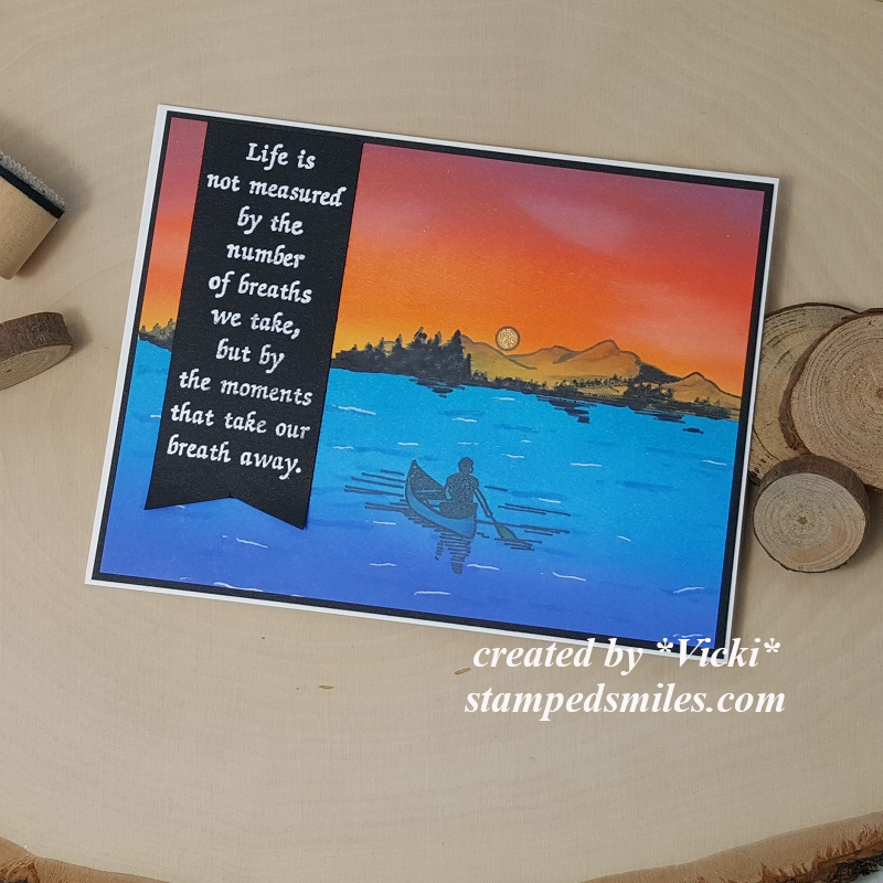
There is just something about this scene that makes me feel happy and relaxed! So of course, that sentiment goes just perfectly with it! This sentiment/saying is one of my all-time favorites and I was thrilled to use it for this design!
I’ve used the “Canoeing” (2905-G) along with the “Mountain Vista” (629-I) From Repeat Impressions for the image stamping over the ink blended scene.
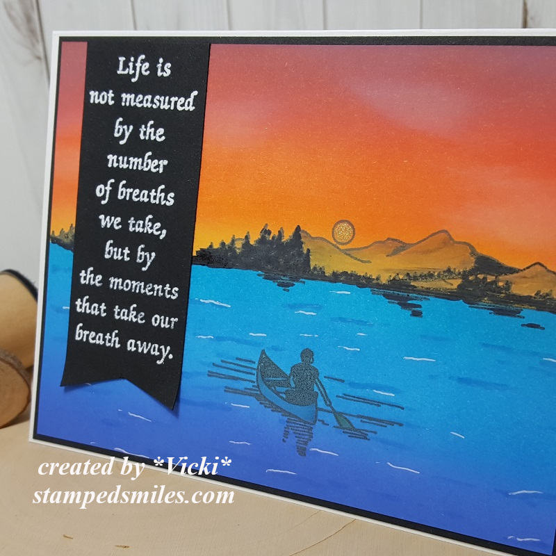
Here’s a closer look at the details in this card with how I went about creating it. You can see the different blended colors in both the water and sky. The setting sun was colored in with a glitter gel pen which created some shimmer to it. The white gel pen highlighted details in the water.
Really had fun creating this scene with these stamps which were just perfect for an ink blended background! I thought this would make for a wonderful retirement card! If you want to create one of these types of cards yourself, please be sure to check out the step-by-step tutorial over at the Repeat Impressions Blog to see how I went about doing this!
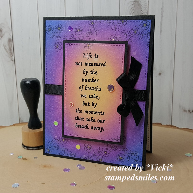
I loved that sentiment stamp so much, that I just couldn’t help but create one more card using it again with another ink blended design:
Really LOVE how this one turned out!
What’s fun about ink blending is all of the different color combinations you can play with and blend together for different looks! This time, I’ve used different colors and started my ink blending in the center. I’ve also used a die to cut out the center of the ink blended panel, heat emboss the sentiment over it, layer with a piece of black cardstock behind it, and pop it up over the rest of the ink blended background. So even though it was cut out in the center, it’s a continuous ink blended design!
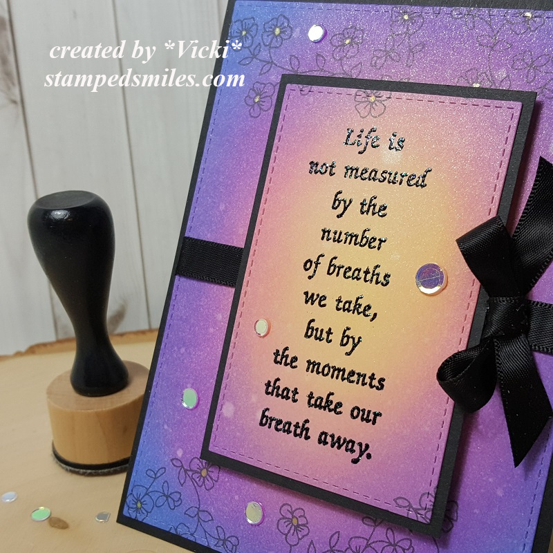
On this ink blended panel, I’ve used some Shimmer Spray over it which gives it a really pretty shimmer with a bit of a “water droplet” effect as the Distress Oxide Inks react to water/liquids. I think this turned out really cool as it gives it sort of a “Bokeh Effect”.
Before I cut out the center of the ink blended panel, I’ve used the “Flower Power Frame” (10202-Q) to stamp in black ink at the top and bottom of the panel. You can see that part of the stamped image was die cut on the sentiment panel. I colored the centers of the flowers with a yellow glitter gel pen for added detail.
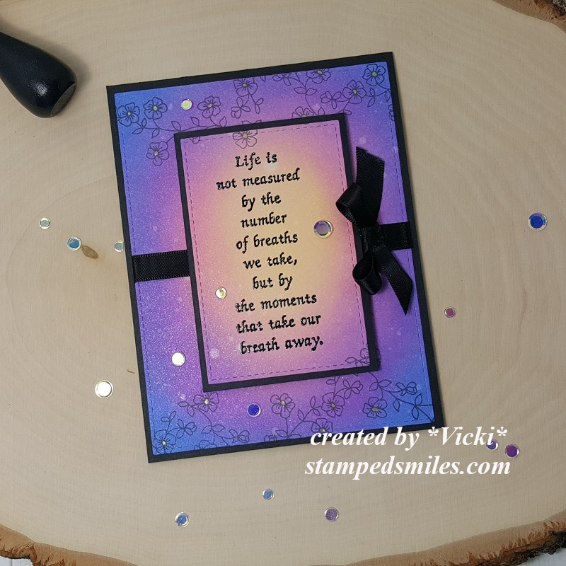
To add to the look, I thought it needed some sparkling clear sequins to finish it off!
I hope you’ve enjoyed my creations today and please be sure to stop on over at the Repeat Impressions Blog to check out the full tutorial on ink blending!
Thank you so much to Wendy and the fellow Rock Star friends for having me along as a guest! Really enjoyed creating these projects with these fabulous stamps!!
Also thank YOU for stopping in today! I appreciate your support so much! I’ll be seeing you again soon my friends!
Challenges I’d like to enter:
- Addicted to Stamps &More – Anything Goes
- Cute Card Thursday – CAS
- Cardz 4 Galz– Black and Bling (second card only)
- Daring Cardmakers – Someone or Something You Love (ink blending, words/verse)
- Creatalicious – #181 Anything Goes with optional embossing
- The Creative Crafters – #25 Anything Goes

So excited to see you guest designing for Repeat Impressions! Your cards are beautifully done, stunning backgrounds, like your peaceful water scene and how you highlighted the sentiment on both!
LikeLike
This is amazing. Makes you just want to be there. Thanks for joining us at Cute Card Thursday. Hugz Andrea.x
LikeLike
Vicki, CONGRATULATIONS on your guest spot! What fun, having you as a Rock Star this week! Your cards are simply gorgeous, as always! Thank you for sharing with us all! Hugs…!
LikeLike
Very pretty scene on the first and beautiful colors on the second. Love your color choices for blending too. So lovely on both. Congrats on the guest spot!
Lynn
LikeLike
Vicki – what a beautiful scene you have created for our POTW – love both your scene (going to read tutorial in just a few) and the card you did using just the sentiment. Love that you were “guest designer” this week – nice especially when you know the guest designer – dear friend.
LikeLike
Stunning creations. Vicki!
xxx Margreet
LikeLike
Fabulous cards Vicki, I love the scene you created qith that beautiful sinset and wonderful quote and your second card the colours are just beautiful with perfect blending which makes the quote stand out, really lovely..congrats on your GT..
Luv CHRISSYxx
LikeLike
Congrats on your GDT spot -so well deserved and both stunning cards ,love the fabulous colour blended backgrounds and perfect quote
Carol x
LikeLike
These cards are stunning Vicki!! I love that sentiment and your beautiful ink blending, what a peaceful scene on your first card! A big congrats on your GDT post too!
Hugs, Tammy
LikeLike
The scenic card is very pretty Vicki, but I love your card with the black ribbon – it is gorgeous! CarolG
LikeLike
Both cards are AMAZING love them both and the colours are just so beautiful..wow.xx
LikeLike
Congrats on your GD spot with Repeat Impressions. Your cards are both wonderful – beautifully blended with colors and such a relaxed and serene theme for each one. I think I’m a little partial to the first one with that beautiful scene as a background for the wonderful sentiment! NJ on both!
LikeLike
Ah, your ink blending work is absolutely stunning! The masculine scene is so peaceful, what a lovely sunset. Late afternoons during late winter can often look something like this in Oslo.
LikeLike
Amazing creations! Absolutely love that quote and your inked background is stunning!
Many thanks for joining us at Cute Card Thursday this week for our Challenge!
Debxx
LikeLike
What fabulous ink blending and I love how atmospheric your lakeside scene is!
Thanks for sharing with us at ATSM!
LikeLike
What stunning beauties, Vicki!! I love these amazing creations!!
LikeLike
Gorgeous ink blending on both cards. Love the sentiment too, so beautiful and so true!! The lone boater in your scene stamping card just takes you right there with him. Awesome cards, both.
Hugs
Sue
LikeLike
They both turned out beautifully! I checked out your tutorial and I would love to try this technique someday. I’m especially fond of the blending and die cutting the center since it all looks (and is) so seamless. Wonderful cards and congrats on your Rock Star status!
LikeLike
Fabulous designs great colours and wonderful sentiments just perfect Love and hugs Carole x
LikeLike
Both of your cards are gorgeous! I love the way you have blended the ink on the second one. Lovely to see you joining us at Creatalicious Challenges.
LikeLike
WOW, two very stunning cards. Thanks for joining in at Daring Cardmakers. x
LikeLike
Beautiful cards. Congrats on your guest spot.
LikeLike
Beautiful project Vicki. Thank you for sharing with us over here at The Creative Crafters Challenge and best of luck with your entry.
Wendy DT Member for https://creativecrafterschallenge.blogspot.com/
LikeLike
Thank you again, Vicki, for joining us at Repeat Impressions’ blog The House That Stamps Built. It’s been an honor and a pleasure to have you as a guest Rock Star. Wonderful tutorial and gorgeous cards! Your blended backgrounds are just stunning! ~ Wendy
LikeLike
How did I miss this post? Both of these cards are fantastic but the coloring you did on the water in the first one is stunning! The second card is in my colors for sure and I adore it. Wonderful sentiment that works perfectly with both cards. 😀
LikeLike
A beautiful card!
Thank you soo much for taking part in our “anything goes + optional embossing” challenge over at Creatalicious & good luck in the draw.
Hope to see you again in our new challenge as well…
Hugs,
Melanie
(DT-Coordinator Creatalicious Challenges)
(DT Crafty Friends)
(DT The Sketchy Challenges)
(DT Simply Create Too)
(DT Kreativtanten)
LikeLike